
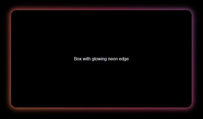
This is a nice little neon glow border style that can be used on elements in a page to draw attention and its not too much code involved. It can be tweaked in loads of different ways to give some real interesting designs.
The CSS:
.gradient-border {
  display: flex;
  flex-flow: column;
  align-items: center;
  justify-content: center;
  width: 600px;
  min-height: 300px;
  color: white;
  padding: 1.8em;
  margin-top: 5em;
}
.gradient-border {
  --borderWidth: 2px;
  --borderRadius: 20px;
  background: var(--bg-color);
  position: relative;
  border-radius: var(--borderRadius);
}
.gradient-border:after {
  content: '';
  position: absolute;
  top: calc(-1 * var(--borderWidth));
  left: calc(-1 * var(--borderWidth));
  height: calc(100% + var(--borderWidth) * 2);
  width: calc(100% + var(--borderWidth) * 2);
  background: linear-gradient(60deg, #f79533, #f37055, #ef4e7b, #a166ab, #5073b8, #1098ad, #07b39b, #6fba82);
  border-radius: var(--borderRadius);
  z-index: -1;
  animation: animatedgradient 3s ease alternate infinite;
  background-size: 300% 300%;
  filter: blur(10px);
}
@keyframes animatedgradient {
	0% {
		background-position: 0% 50%;
	}
	50% {
		background-position: 100% 50%;
	}
	100% {
		background-position: 0% 50%;
	}
}
The HTML:
<div class="gradient-border">
  <p>Box with glowing neon edge</p>
</div>